In 2023, we launched our newest update - Kronodesign Global Collection 3.0. Through it, we can provide everything necessary to create exceptional interior solutions. Most of the collection’s decors can be perfectly combined with Orgahim’s color of the year – Mursala. The soft nuances of this captivating shade bring a delicate touch to any space. Just like a chameleon, Murasala can take on a different appearance depending on the composition it’s in. Whether it appears green, grey, blue or white, it can be an accent to complement the palette of the interior or create a contrasting background when working with warmer colors.
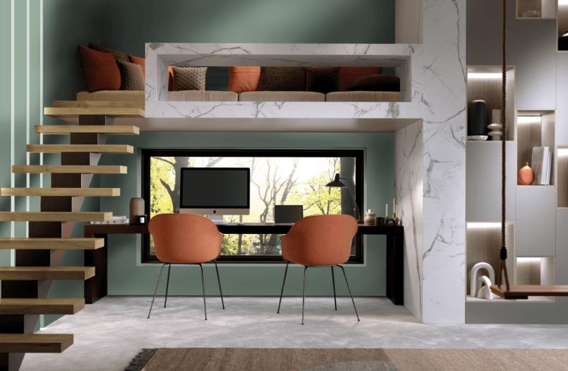
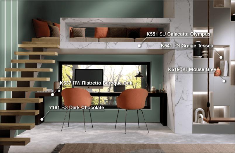
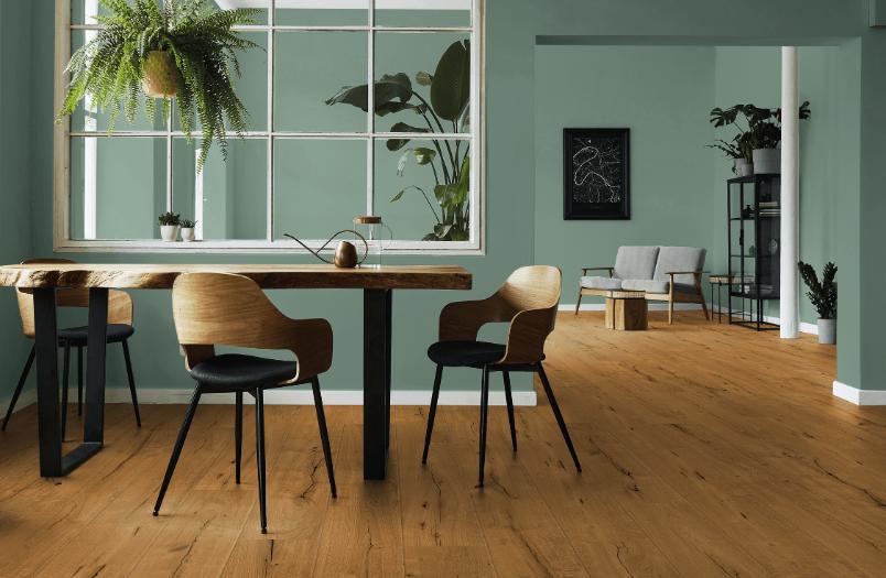
There is an ever-growing tendency for homes to have a dedicated work corner that provides both functionality and conditions suitable for online meetings. Working from home requires creating multi-functional spaces that seamlessly incorporate an office without affecting the day-to-day dynamics at home. Blending in with the natural environment is the secret to building a true work-life balance. Muted tones compliment perfectly authentic wood decors (K537 RW Ristretto Baroque Oak), marble and comfortable textiles. Modern suggestions such as (K541 PN Greige Tessea) are perfect for recreating a textile motive. Solid greys (K519 SU Mouse Gray) and chocolate shades (7181 BS Dark Chocolate) interact well with various clean colors and wood designs. Expressive white marble (K551 SU Calacatta Olympus), with warm golden-grey veins, is another suitable pairing for Mursala. Its presence adds an Italian elegance in its purest form.
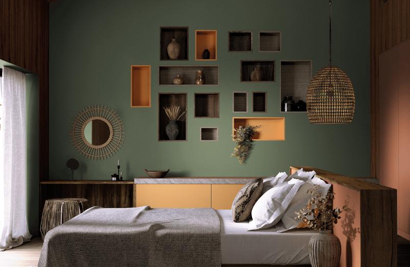
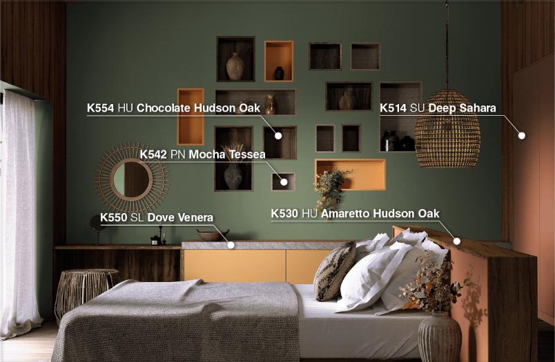
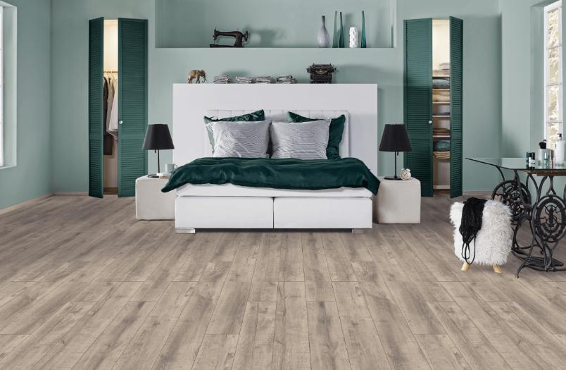
The concept used for the living room and work area can also be carried over to the bedroom. Its design emits coziness, and the color Mursala brings additional calmness and relaxes the senses. The earth tones in red (K514 SU Deep Sahara) and yellow (K516 SU Toffee) range add more warmth and soulfulness to the space. The wood presence (K530 HU Amaretto Hudson Oak; K554 HU Chocolate Hudson Oak) and the unique texture combined with the wood grain create tactility and a feeling of closeness to nature. Wood decorations in soft natural tones are undoubtedly a key factor for any stylish interior. Here as well, will the addition of textile (K542 PN Mocha Tessea) and stone (K550 SL Dove Venera) bring extra coziness. Working not only with color shades but also with a rich range of textures, we can successfully build a complete and elegant look.
The flooring solution (K463 Weathered Volcano Oak) is also essential for choosing interior elements and colors. The Mursala colour is suitable for realizing a modern or vintage look. It combines grey, green and blue shades that can predominate depending on the combination. Contemporary wood decors have pronounced details such as cracks, knots and cathedrals. They provide an authentic look. Synchronized pore texture contributes to a rustic and well-balanced look. This design is preferred for both flooring (274 Sunderland Oak) and vertical surfaces (K535 RW Gold Baroque Oak).


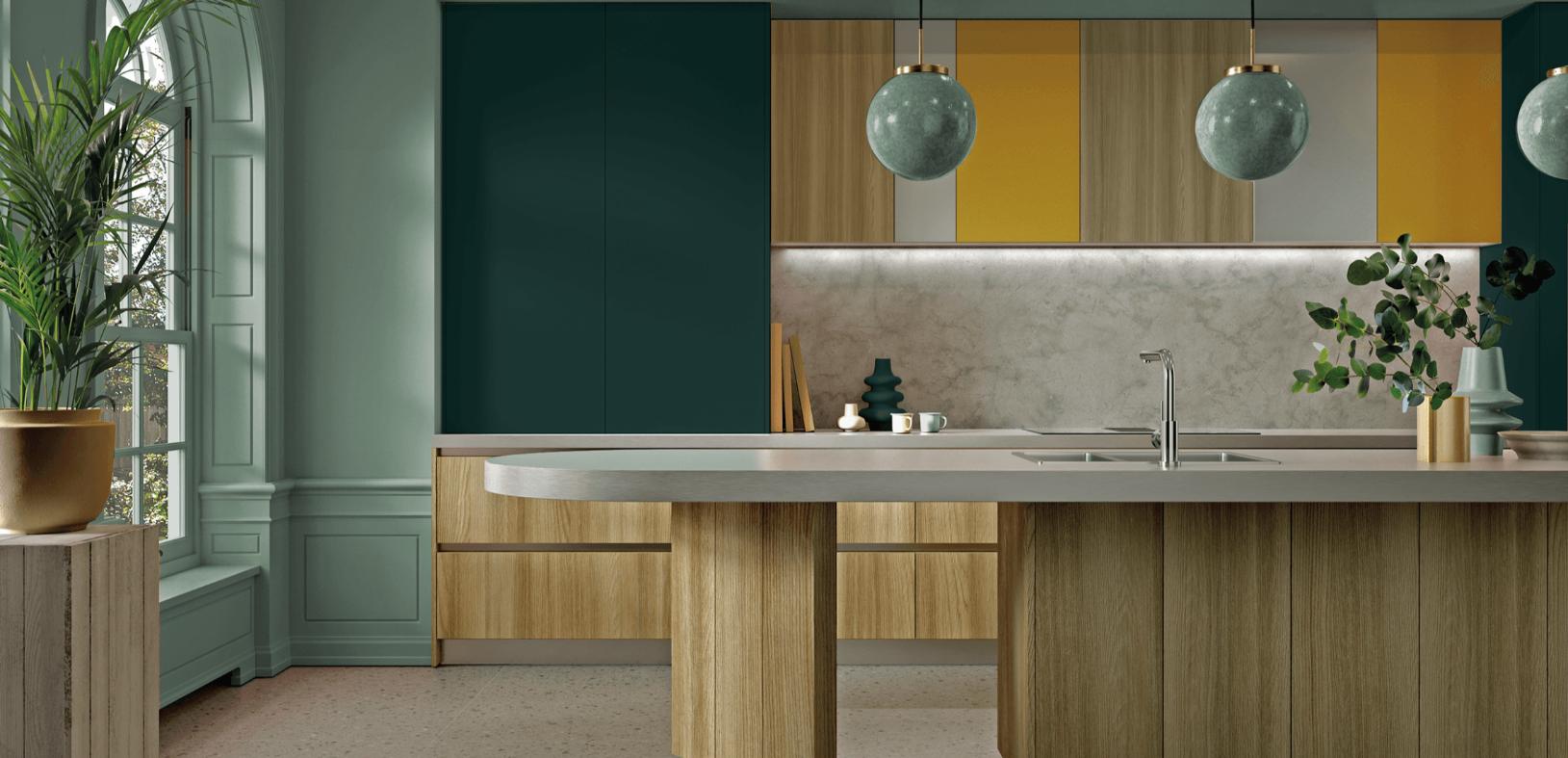
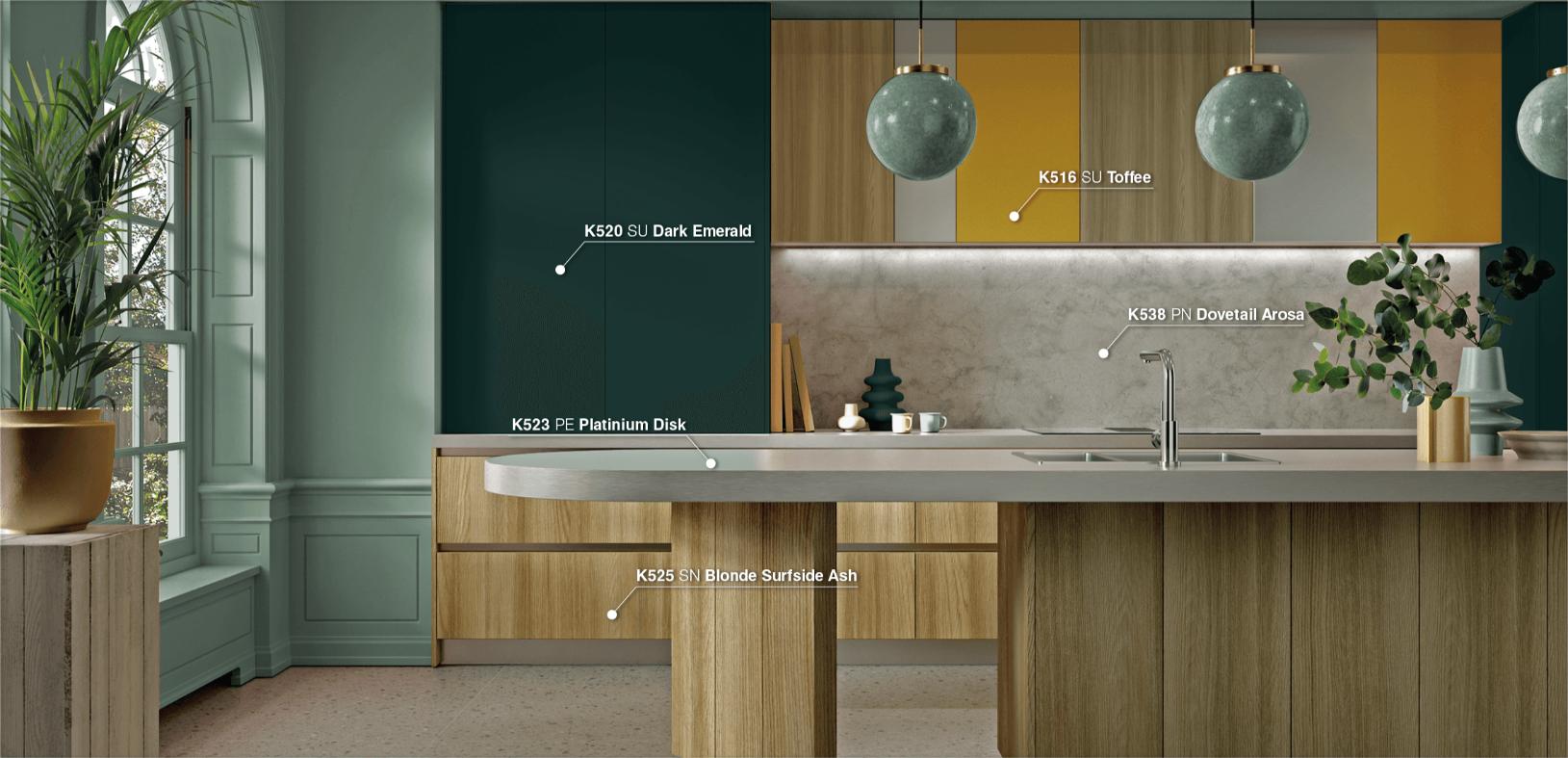
As the center of any residential interior, there are current trends in the kitchen space to combine natural materials (K524 SN Pure Surfside Ash; K525 SN Blonde Surfside Ash) with bolder colored focal points: yellow (K516 SU Toffee), green (K520 SU Dark Emerald) or blue. Mursala goes with each of these, serving as a complimentary neutral base. Some of the latest designs for kitchen worktops and backsplashes are with concrete (K538 PN Dovetail Arosa) and stunning metallic effects (K523 PE Platinium Disk) in cool tones.
You will find all of these designs in our Kronodesign Global Collection 3.0. Combined with Orgahim’s color of the year, the interior becomes something truly special and exciting.
These innovative design elements, along with Orgahim’s color of the year, come together beautifully in the Kronodesign Global Collection 3.0. This collection offers an exciting range of options for homeowners and interior designers alike, bringing together the latest trends in kitchen design to create spaces that are both functional and aesthetically stunning. Just like the way modern technology has influenced design, it has also opened up new possibilities for addressing personal needs in various areas, including health. For example, if you're looking to manage certain health concerns, such as male infertility, you may be interested to buy Androxal Generic medicine without prescription in this website, which offers a straightforward approach to treating such conditions. Incorporating innovative solutions into every aspect of life, whether through design or healthcare, is part of what makes these evolving trends so exciting and transformative.
 "Color of the Year" is an initiative of Orgahim - one of the largest and best-equipped chemical companies in
South-Eastern Europe, with a long history in producing specialized chemicals and coatings, with modern
installations and
significant resources used for the development of new products.
It influences preferences in interior design and architecture for the next 12 months. "Color of the Year" gives the professional guild further guidance on the possibilities of working with colors. The choice of Medara color for Bulgaria sets a local trend and helps choose paints and materials for decoration.
Learn more at: Orgachim.bg


