

COMBINATIONS
Natural Layers
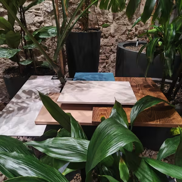
Wood with character, stone-inspired surfaces and a palette of earthy tones that finds the perfect contrast in a petrol blue accent. This month’s selection plays with textures and finishes that complement one another: the depth of Flamed Arvadonna Chestnut, the warmth of Alpaca, the mineral-like appearance of Babylon Slate and Villa Augusta, and the intensity of Petrol’s blue-green hue. The result is a balanced combination, with materials that work together naturally and offer plenty of possibilities for creating contemporary and welcoming interiors.
Used decors



The Journey of Materials
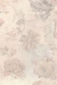
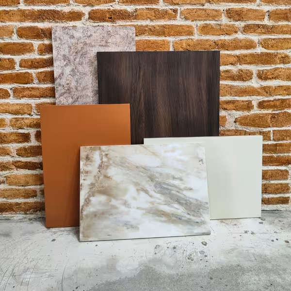
This month we explore interiors born from the encounter between cultures, textures and landscapes. A selection that evokes the richness of natural materials reinterpreted through a contemporary lens. The mineral richness of Breccia Vivaldo adds movement and character, while the warm tones of Deep Sahara convey the energy of the earth and the light of sunset. Mussel acts as a balancing element, bringing calm, delicacy and a tactile sensation that connects with materials such as linen and stone. The depth of Ristretto Baroque Oak adds history and sophistication through vintage-inspired wood, and Silk Road completes the narrative by evoking routes, exchanges and the fusion of influences that have shaped design over time. The result is a palette that combines authenticity, warmth and sophistication: a sensory journey where stone, colour and wood interact to create spaces with personality and timeless elegance.
Used decors
-
 K537 Ristretto Baroque Oak /Contempo; Worktops Square Edge; Kitchen Splashbacks; Door Laminates; LHDF;/
-
 K594 Breccia Vivaldo /Worktops Slim Line Plus;/
-
 K5982 Mussel /Color;/
-
 K514 Deep Sahara /Color; Door Laminates;/
-
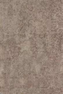 R254 Silk Road /Rocko Tiles/
Nature Reimagined
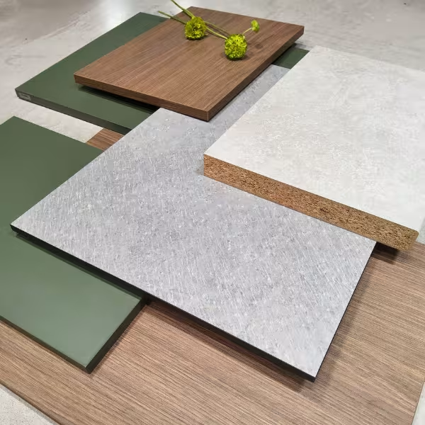
The selection of materials strikes a balance between the mineral and the organic. The design draws on a timeless palette that creates a sense of refuge, evoking natural landscapes through a contemporary lens. The starting point is the Crema Limestone (K209) stone-effect finish, whose rough texture and variations of grey, white, and beige evoke the authenticity of sedimentary rock, providing a neutral, luminous, and highly functional base for high-traffic surfaces. Against this mineral backdrop, a chromatic counterpoint is introduced with Smoke Green (K521), a deep, nuanced green that adds character without losing serenity. Its rich, traditional nature allows for the creation of calm spaces, especially when combined with neutral tones or wood, reinforcing an enveloping and balanced sensation. Umber Primavera Oak (K696), whose synchronized grain and non-repetitive design reinforce the material’s authenticity, provides warmth. Its brown tones and linear pattern bring elegance and visual continuity, especially in larger-scale pieces or statement furniture. Finally, Dove Venera (K550), which acts as a transitional tone, brings the ensemble together: a soft neutral that balances the intensity of the green and the presence of the wood, fostering a harmonious interpretation of the space.
Used decors


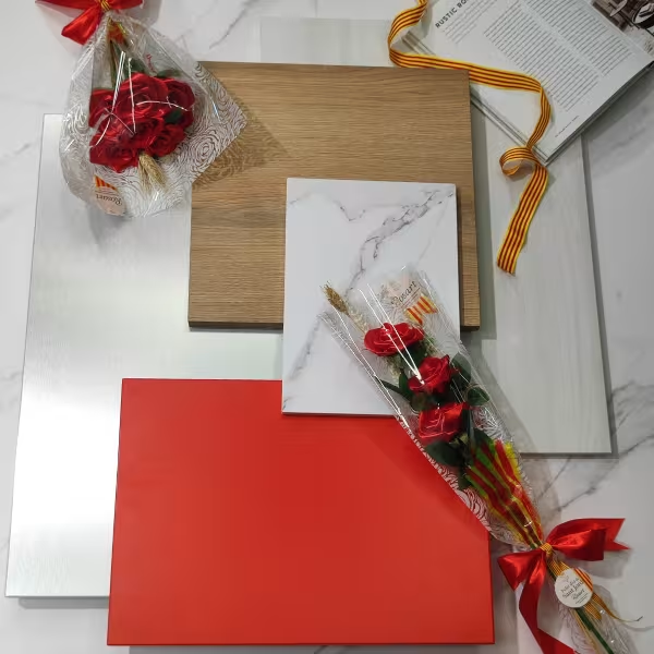
Legends in Textures - Saint George's Day 2026
In Barcelona, legends aren’t just read – they’re felt. 🌹📖 23 April isn’t just any old day in Barcelona; it’s when the city breathes culture and romance. This year, we wanted to pay tribute to our city by blending design with tradition. From the vibrant red of our Chilli Red range to the warmth of the oak trees that evoke the pages of an eternal book. Which design would you give as a gift today? Roses by @rosart_oficial
Used decors
-
 K551 Calacatta Olympus /Worktops Square Edge; Worktops Slim Line Plus; Kitchen Splashbacks; Rocko SPC Wall Panels/
-
 K524 Pure Surfside Ash /Contempo; Door Laminates;/
-
 K7113 Chilli Red /Color; Door Laminates; Compact Interior; Black Line Cubes; Color/
-
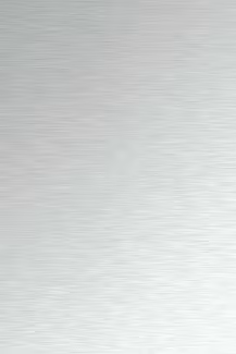 AL01 Brushed Aluminium /Metal;/
-
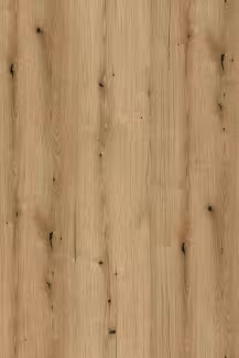 K365 Coast Evoke Oak /Most Preferred 2.0; Standard; Worktops Square Edge; Kitchen Splashbacks; Rocko SPC Wall Panels; Shelving Boards;/

Female Gaze
March celebrates the feminine gaze: balance, intuition and character in perfect harmony. The warmth of K096 SU Clay Grey and its grey-brown hue connects with that ability to create cosy and solid spaces. The light and shade of K079 PW Grey Clubhouse Oak evokes depth and authenticity. The elegance of K023 SU Venato, with its grey grain and sophisticated presence, brings character and determination. On this basis, 22868 MN Maracuja Red introduces energy and passion, while 22869 MN Arosa Violet adds sensitivity, intuition and creativity. A palette that speaks of serene strength, versatility, contrast and harmony. Because there are combinations that, like women, stand out for their ability to sustain, transform and bring beauty with their own character 💜 Moodboard base: K686 PD Powder Pink, K683 PD Cajun, K521 SU Spice Red, K512 SU Native Pink.

Midnight Parade
February's moodboard is inspired by Carnival as an expression of creativity, colour and theatricality. The city's nocturnal aesthetic, with lights, reflections and intense materials, and contemporary industrial design. The idea of contrast as a design language: matte and gloss, dark and light, strength and elegance. It is an explosion of energy, light and character. The palette is built from intense, deep tones that interact with each other to create a vibrant, sophisticated and dynamic whole. The star of the show is K7113 BS Chilli Red, a bold, bright red that brings dynamism, passion and action. Its intensity sets the pace for the composition. The blacks — K218 GG Black Andromeda and K190 HG Black — balance this chromatic force, adding depth, elegance and mystery. Black Andromeda introduces an almost theatrical effect thanks to its metallic flecks, which reflect light and create subtle sparkles, while the smooth black reinforces the feeling of contrast and timeless sophistication. AL05 Brushed Copper, a warm metallic finish that adds texture, shine and exclusivity, elevates the ensemble. Its coppery hues visually connect with the red and add a sensory dimension reminiscent of artisanal luxury and contemporary design.
Used decors
-
 K7113 Chilli Red /Color; Door Laminates; Compact Interior; Black Line Cubes; Color;/
-
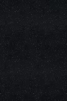 K218 Black Andromeda /Worktops Round Edge; Worktops Square Edge; Kitchen Splashbacks;/
-
 K190 Black /Trend Designing Reality; Most Preferred 2.0; Acrylic Matt; Acrylic Gloss; Feelness Ultra Matt; Feelness High Gloss... /
-
 Al05 Brushed Cooper /Metal;/
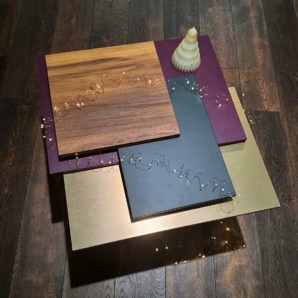
Warm December: Nature, Spices and Festive Sparkle
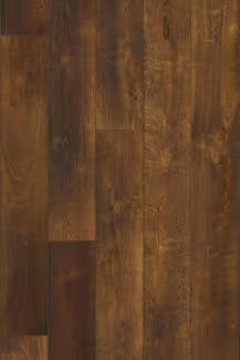
The December moodboard is built around a warm and enveloping palette, inspired by the emotional depth of winter and the traditional aesthetics of Christmas, reinterpreted in a contemporary way. Each material chosen brings a different sensory nuance, creating a balanced ensemble between nature, sophistication and festive warmth. Spice Red adds a vibrant and spicy accent, while Dark Forest introduces the natural calm of winter green. Amber Baroque Oak and Incando woods add warmth and authenticity, and Brushed Copper adds an elegant metallic touch reminiscent of festive sparkles. The ensemble creates a balanced, intimate and contemporary atmosphere, perfect for interiors with a Christmas spirit but a modern approach.
Used decors


Timeless warmth
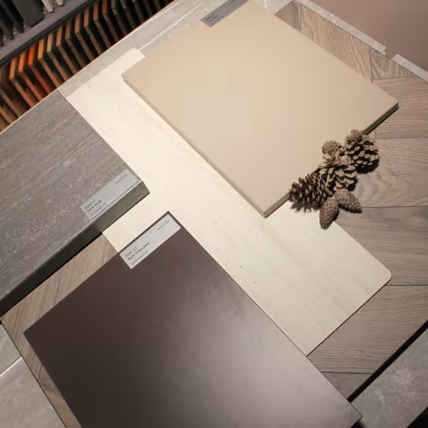
This palette combines elegance, warmth and natural textures, offering inspiration to create spaces that convey harmony and sophistication. K488 CM Rutherford Oak; a greyish brown oak laid in a herringbone pattern that lends an air of distinction. Its timeless design adapts naturally to both classic and contemporary interiors, enhancing the feeling of refinement in any setting. 7181 BS Dark Chocolate; a dark brown with subtle reddish hues that evokes depth and warmth. Perfect for creating cosy and enveloping environments, especially in large or well-lit spaces. K096 SU Clay Grey; an urban grey with a warm hue that balances the neutrality of the colour with a contemporary presence. Its versatility allows it to be combined with woods, stones and earth tones, achieving a modern and serene interior. R191 P Travertine; inspired by the beauty of natural stone, it features beige and ivory tones that convey serenity and sophistication. Its versatile character makes it an ideal choice for projects seeking a balance between classic and modern. K213 RS Dark Tivoli; brown stone design with a balanced texture that blends harmoniously with neutral colours and wood grain. It brings depth and visual coherence to elegant and contemporary spaces.
Used decors
-
 K488 Rutherford Oak /Organic CLEVER SILENT 6+1 mm PerfectPad®ECO; HERRINGBONE 8/
-
 K7181 Dark Chocolate /Color; Door Laminates; Color/
-
 K213 Dark Tivoli /Worktops Round Edge; Kitchen Splashbacks/
-
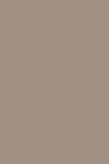 K096 Clay Grey /Feelness Invisible Touch; Color; HPL Invisible Touch; Door Laminates; Color/
-
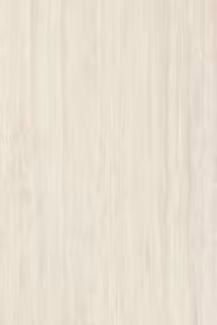 R191 Travertine /Rocko SPC Wall Panels/
Autumnal Elegance
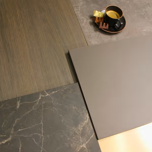
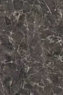
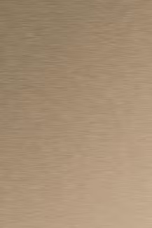
This month is full of textures, contrasts and elegance. The inspiration for the moodboard was the beginning of autumn and, with it, the colour palettes that generally represent this season. Fusing industrial, metallic and natural elements, with a view to creating interiors with personality. For this composition, we used design 4299 SU Dark Atelier, which reproduces concrete reinterpreted with an industrial feel. AL06 Brushed Bronze, a bronze colour with a brushed effect, K684 PD Black Truffle, a sophisticated dark brown perfect for highlighting other elements. K553 SU Galaxus, an anthracite marble with crystalline veins, and K697 PV Cocoa Primavera Oak, an oak with no repetitions, with a relief texture and dark tones that give it character.
Used decors
-
 4299 Dark Atelier /Contempo; Worktops Round Edge; Kitchen Splashbacks/
-
 K553 Galaxus /Worktops Square Edge; Worktops Slim Line Plus; Kitchen Splashbacks/
-
 K697 Cocoa Primavera Oak /Trend Designing Reality; Harmony/
-
 K684 Black Truffle /Trend Designing Reality; Feelness Ultra Matt; Color/
-
 AL06 Brushed Bronze /Metal/
March in harmonious tones
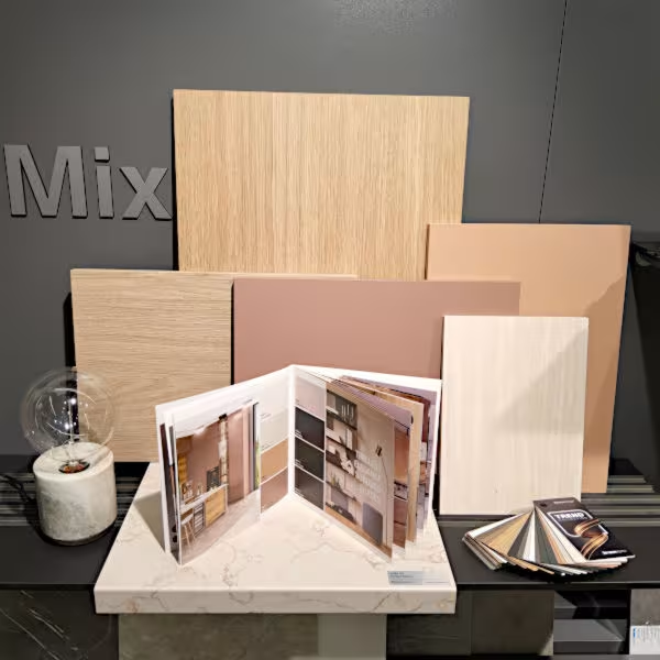
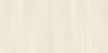
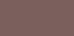
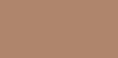
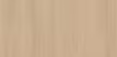
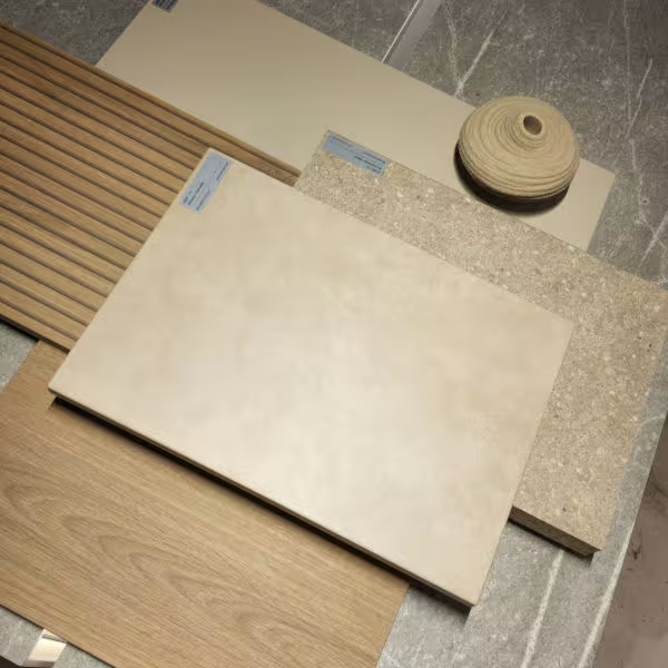
This month we immerse ourselves in a relaxing and delicate aesthetic, combining woods, stones and earthy tones of the new Kronodesign Trend Collection. K704 Perlino Sabbia, a 38 mm particleboard worktop with rounded edges, with an elegant irregular and contrasting grain. K750 Agra Travertine, 12 mm compact board in beige and ivory tones, with a monochrome core. K683 Cajun, with tan and pink tones and K682 Alpaca, between peach and brown tones, are melamine particleboard with Pearl Sand matte texture. K694 Silk Primavera Oak and K695 Straw Primavera Oak, boards with synchronized embossing, reproducing faithfully the grain of the wood and with a non-repeating pattern, creating an exceptional realism.
Used decors

February with sandy shades
We were inspired by sandy, beige and wood tones, a palette that conveys balance, sophistication and a connection to nature. K691 Almond Granada, a rocky design that brings a close-to-nature feel with a yellowish beige tone. K705 Stonehaven Sand, expresses a visual balance between cool and warm tones, soft and rough textures. K689 Natural Canella Strata and K688 Natural Canella Oak, one tone - two designs, create a welcoming and harmonious space by combining the contemporary aesthetics of wood strips with classic grain and enhanced knots. K681 Macadamia, perfectly matches the natural textures of stone and wood.
Used decors


A Symphony of Warmth and Sophistication
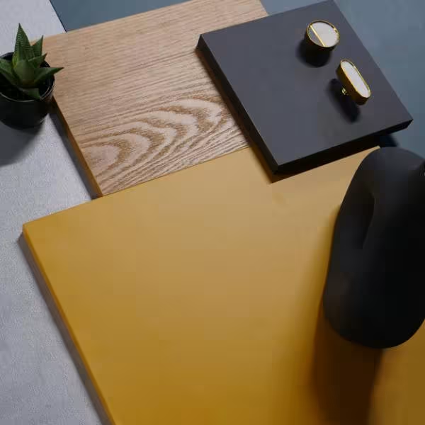
Welcome to the New Year with elegance and style. Picture the rich and comforting color of toffee caramel and the jewel-toned hue of dark emerald green, both enveloping the space in a sense of warmth and coziness. Always on-trend, the metallic sheen and deep, grounding shades mark the new beginning with glamour and sophistication. To elevate the aesthetic further, introduce oak design with synchronized embossing texture, which ties all elements together, offering a cohesive and inviting ambience. Let this palette inspire you. Grab the possibilities and adventures that the year ahead holds.
Used decors


Let's Switch to Holiday Mode
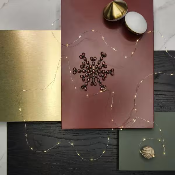
Let's switch to the enchanting mode of the winter holidays. The juxtaposition of a sleek charcoal chestnut design with synchronized embossing and a lavish marble countertop creates a truly luxurious ambience. Accentuated by a timeless seasonal pairing: the gleam of gold and the charm of green and red hues, this curated combination brings forth a classy and festive spirit.
Used decors

Harmonious Coexistence
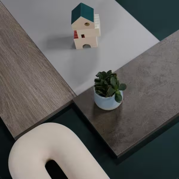
Step into a realm of calm and serenity with our November moodboard, where the earthy tones of grey-brown wood decor and the rugged beauty of stone designs merge to create an ambience that's both inviting and grounded. Complemented by the timeless elegance of grey and the rich depth of dark green, this curated combination showcases how contemporary style and natural elements coexist harmoniously.
Used decors
Sense of mystery and sophistication
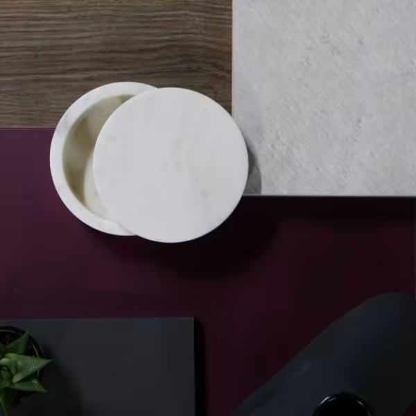
Bring a modern and sleek feel to your interior, with bold and regal accents. Dare to use a deep purple color, serving as a mystery backdrop for the other elements, and an anthracite matt nuance evoking a touch of drama. The earthy grey-brown ash decor adds warmth and texture, while the stone introduces opulence and a sense of timeless beauty. This harmonious and refined theme exudes elegance and depth and infuses the design with luxurious aesthetics.
Used decors


Contemporary Contrasts
Enjoy an appealing aesthetic that balances industrial and modern elements. Bring an urban edge to the space with coordinated solutions and a concrete-like decor. For example, opt for a dining table and bookshelves to create a cohesive theme and anchor the room. Use dark wood and bronze metal combinations to achieve both a modern flair and a touch of natural beauty. For more drama, аdd an earthy basalt color while maintaining a sleek and minimalist look.
Used decors


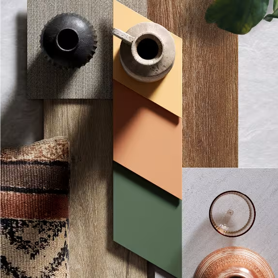
Nomad
For new experiences and awareness of our deeply rooted connection with nature, we strive for harmonious combinations of different materials and colors to arrange our space in a balanced and attractive way. Choosing warm shades of yellow, coral, and green brings vibrancy to the design, evoking a wanderlust. Wood elements add a cozy and rustic touch, while stone accents provide a grounded and earthy feel. Textile patterns contribute softness and depth to the overall aesthetic.
Used decors
-
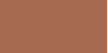 K514 SU Deep Sahara /MF MDF, Color, Kronodesign/
-
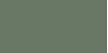 K521 SU Smoke Green /MF MDF, Color, Kronodesign/
-
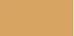 K516 SU Toffee /MF MDF, Color, Kronodesign/
-
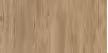 K544 Hazel Silverjack Oak /MF PB, CONTEMPO, Kronodesign/
-
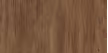 K545 Vintage Silverjack Oak /Worktop, Square Edge, Kronodesign/
-
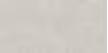 K549 Sand Venera /Worktop, Square Edge, Kronodesign/
-
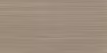 K542 PN Mocha Tessea /MF PB, CONTEMPO, Kronodesign/
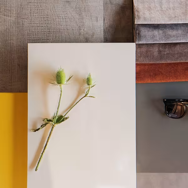
The message
With the choice of colors for 2021, the Pantone Institute has sent a message for strength and hope. The sun warmth of yellow and the serenity of gray create is a combination that gives a sense of security and stability. We combined these decors with different shades and soft fabrics to add more coziness and depth to the space.
Used decors


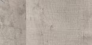
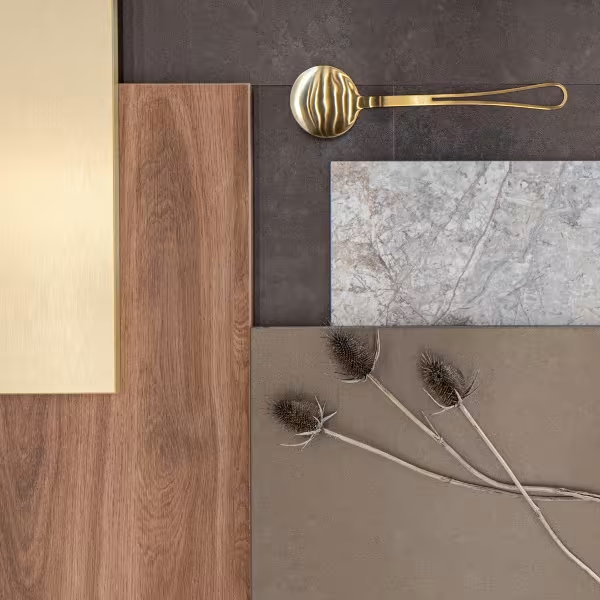
Golden autumn
Soft and warm as autumn, our decor motions combine wood, stone and metal. The deep brown shades, the different textures, the delicate sheen of the golden surfaces bring a refined style to any design decision.
Used decors
-
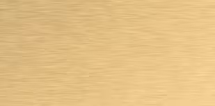 AL04 Brushed Gold /MF MDF, Kronodesign AVANT-GARDE METAL/
-
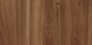 K359 PW Brandy Castello Oak /Laminated board, Kronodesign TRENDS/
-
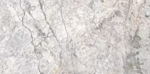 K369 PH Cloud Nebula /Worktop with postforming, Kronodesign TRENDS/
-
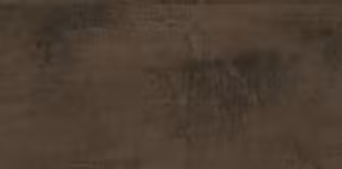 K5579 Metal Oxide Dark Brown /Laminate, Keindl® Aqua Pro/
-
 8348 PE Bronze Age /Laminated board, Kronodesign COLOR/
Warm sunny rays, smell of rain and green grass
Invite spring to your home and create a close to nature feeling. Embrace the fresh and tender touch of this charming season. Use shades of green, soft matt surfaces and decors that resemble the authenticity of stone and wood.
Used decors

Romantic dates
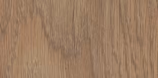
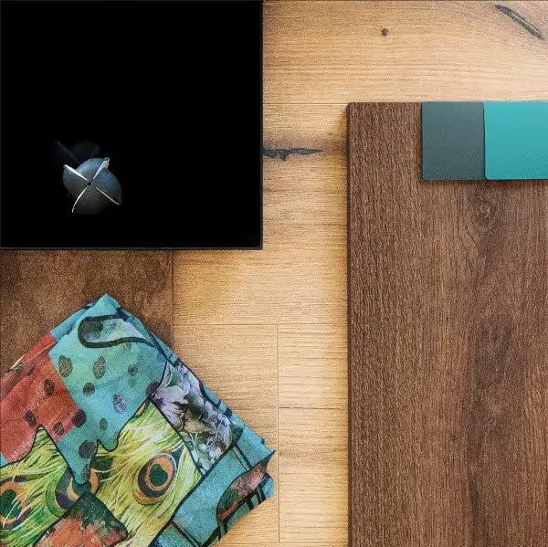
Beautiful wood decors, warm brown nuances and contrasting blue colors bring calm and freshness in the interior design. Use the depth of the black decor and the rusty shades of the metal to add urban style or rustic accents. This matches, creating a feeling of romance, can be suitable both for the atmosphere of a nestled in the mountains hut and for the cafeteria behind the corner with the most delicious croissants.
Used decors
-
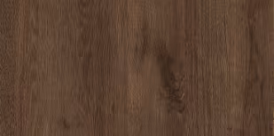 K090 PW Bronze Expressive Oak /Laminated board, Kronodesign STANDARD/
-
 0190 AG Black /Laminated board, Kronodesign COLOR/
-
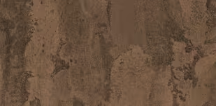 K351 RT Rusty Flow /Laminated board, Kronodesign TRENDS CONTEMPO/
-
 0244 BS Petrol /Laminated board, Kronodesign COLOR/
-
 0245 BS Ocean /Laminated board, Kronodesign COLOR/
-
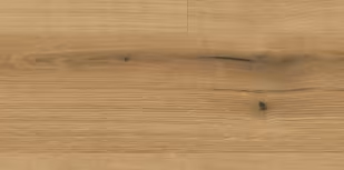 K5573 Oak Evoke Coast /Laminate, Kаindl® Natural Touch Standard/
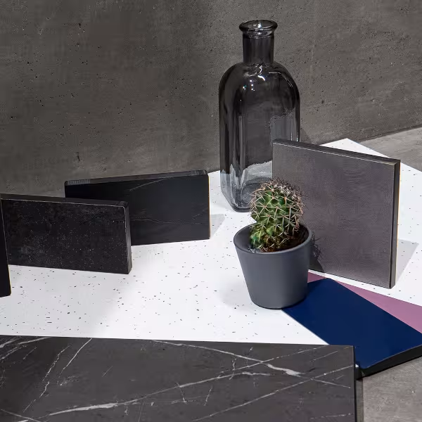
The energy of simultaneous contrasts
Create a sophisticated interior that will provoke your senses. Bring balance and creativity with shades of black, gray and white. Use soft light and different materials to emphasize textures. Add deep emotional moments with color accents like blue and purple.
Used decors
-
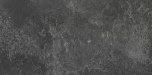 K205 SL Black Concrete /Worktop, Kronodesign Slim Line Plus/
-
 0190 AF/SL Black /Worktop, Kronodesign Slim Line Plus/
-
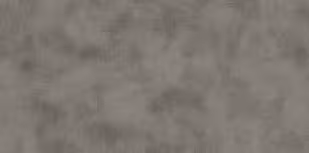 K108 SU Peltro /Laminated board, Kronodesign CONTEMPO/
-
 8984 BS Navy Blue /Laminated board, Kronodesign COLOR/
-
 K217 GM White Andromeda /HPL bonded MDF, Kronodesign Invisible Touch/
-
 7167 SU Viola /Laminated board, Kronodesign COLOR/
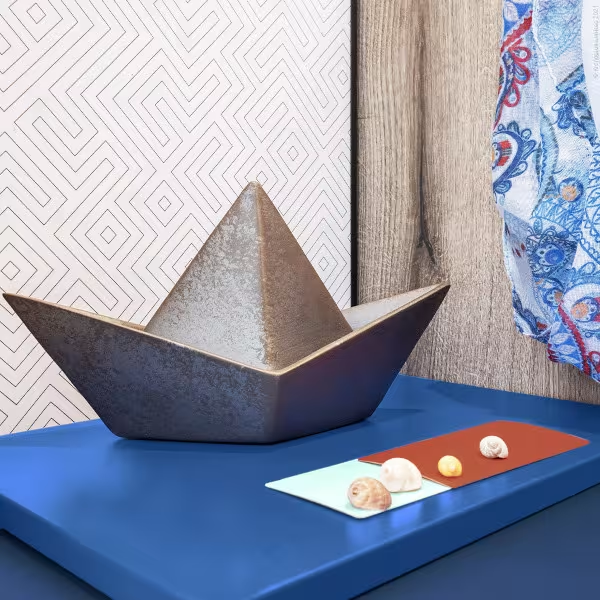
My favorite blue
Deep and mysterious, blue shades always reminiscent of the endless sea, the magic of night, the romance of summer. Combined with
Used decors
-
 0125 BS Royal Blue /Laminated board, Kronodesign COLOR/
-
 7180 BS Mint /Laminated board, Kronodesign COLOR/
-
 K098 SU Ceramic Red /Laminated board, Kronodesign COLOR/
-
 K099 SU Midnight Blue /Laminated board, Kronodesign COLOR/
-
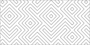 K219 SU Labyrinth /Kitchen panel, Kronodesign/
-
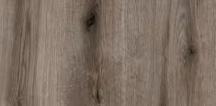 K366 PW Fossil Evoke Oak /Laminated board, Kronodesign COLOR/
Magic, soft light and scent of cinnamon
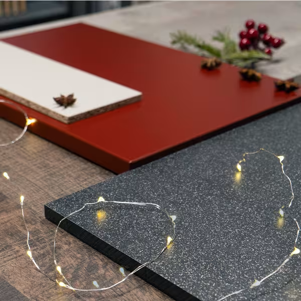
Holidays during the year are always exciting. They bring us joy and sharing. Our combination of decors will infuse home coziness in your personal space and will gift you with the most warm family feeling.
Used decors
-
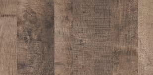 K354 PW Colonial Grange Oak /Laminated board, Kronodesign TRENDS CONTEMPO/
-
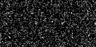 7099 GM Black Omega /Worktop, Kronodesign Slim Line Plus/
-
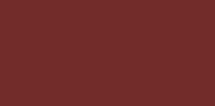 9551 BS Oxide Red /Laminated board, Kronodesign COLOR/
-
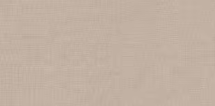 5437 EE Lino Canovas /ЛПДЧ, Kronodesign/
-
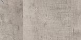 K355 PW Platinum Grange Oak /Laminated board, Kronodesign TRENDS CONTEMPO/
-
 AL06 Brushed Bronze /MF MDF, Kronodesign AVANT-GARDE METAL/
The always modern classics
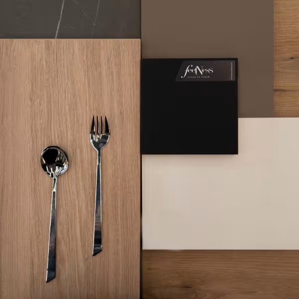
The combinations of wood and monochrome neutral colors is classic and yet temporary. The depth of the marble, the fine contrasts and the soft matt surfaces create the feeling of space. Suitable for a kitchen area, adjacent island or dining room, these decors are not only stylish but also practical.
Used decors
-
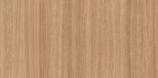 5501 SN Slavonia Oak /Kronodesign Contempo Compact Interior/
-
 0190 UM Black /MF MDF, Kronodesign Feelness/
-
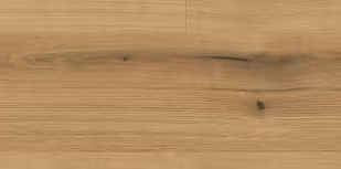 K5573 Oak Evoke Coast /Laminate, Keindl® Natural Touch Standard/
-
 0564 UM Almond /MF MDF, Kronodesign Feelness/
-
 6299 UM/BS Cobalt Grey /MF MDF, Kronodesign Feelness/
-
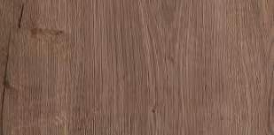 K409 SU Black Pietra Marble /Laminated board, Kronodesign/
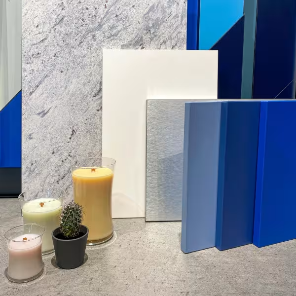
Winter Tale
Blue can often be found in nature. Whether it is the light blue sky during the day or the dark blue lake waters, the shades of this color bring peace and relaxation. We offer you an interior decision in the cold gamut, combined with the metallic luster of silver, the purity of white and the depth of granite. Reminiscent of a winter tale, these decors will match perfectly into the design of your office, nightclub, and why not an accent kitchen.
Used decors
-
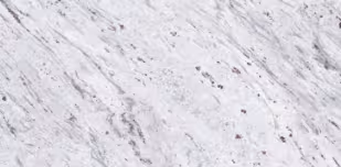 K371 PH White Valley Granite /Worktop with postforming, Kronodesign TRENDS/
-
 AL01 Brushed Aluminium /MF MDF, Kronodesign AVANT-GARDE METAL/
-
 8685 UM Snow White /Laminated board, Kronodesign COLOR/
-
 0121 BS Capr Blue /Laminated board, Kronodesign COLOR/
-
 0125 BS Royal Blue /Laminated board, Kronodesign COLOR/
-
 K099 SU Midnight Blue /Laminated board, Kronodesign COLOR/
In the lap of natural beauty magnificence
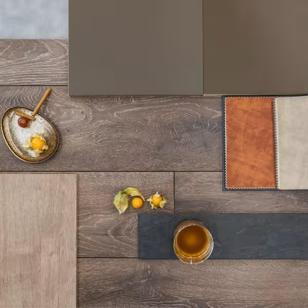
Create a relaxing atmosphere by using stone, wood, leather and other organic materials. Choose dеcors with visible imperfections in their characteristics - the knot and cracks in the wood designs, the irregularities in the stone texture. Combine with neutral colors with ultra matt or high gloss surfaces and enjoy the warmth and comfort in your interior.
Used decors
-
 7166 HG/BS Latté /MF MDF, Kronodesign Feelness/
-
 K233Earthen Oak /Laminate, MyStyle MyArt/
-
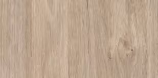 7063 SU Pastel Green /MF PB, Kronodesign COLOR/
-
 7045 АМ Satin /MF PB, Kronodesign COLOR/
-
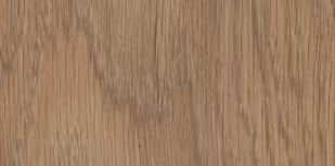 5947 Historic Oak /Laminate, Eurohome® Residence/
East to west
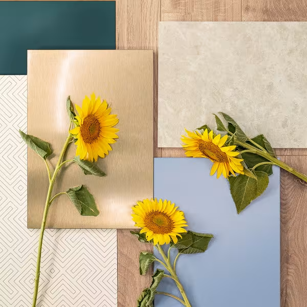
If we follow the sunflowers’ gaze, we will enjoy the inspiring beauty of sunrises and the enchanting warmth of sunsets. Bring these vibrations of light into your home by combining mild wood and marble decors, shades in the blue-green gamut, different shapes and textures. Enjoy an interior that recreates the energy of sun and the magic of summer.
Used decors
- K367 PH Cream Navona /Worktops, Slim Line, Kronodesign/
- 0244 SU Petrol /MF PB, Kronodesign COLOR/
-
 AL06 Brushed Bronze /MDF with Aluminum Cover, Metal, Kronodesign//
- K219 SU Labyrinth /Kitchen wall backsplashes, Kronodesign/
-
 K285 Hybridge Oak /Laminate flooring, Atlantic 12 MO.RE!/
- K367 PH Cream Navona /Worktops, Slim Line, Kronodesign/
Integrity and harmony in the rhythm of spring
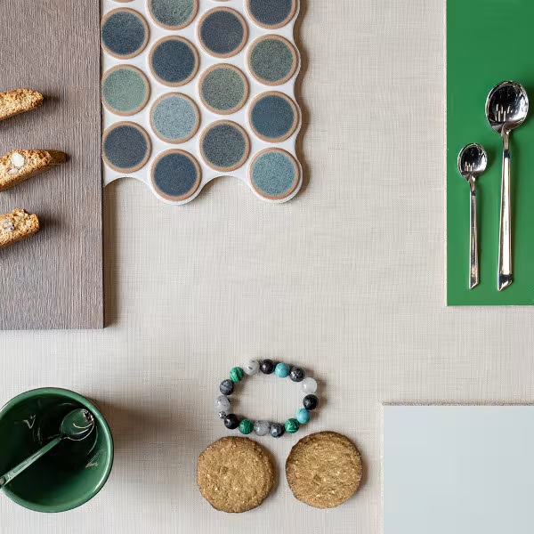
Gentle matches, tactile surfaces, round shapes and fresh green accents create a feeling of integrity, resilience and coziness in space. The neutral color of the textile decor reminds us of natural fabrics like linen and canvas and gives light and harmony in the whole design.
Used decors
-
 5437 EE Lino Canovas /MF PB, Kronodesign/
-
 7063 SU Pastel Green /7063 SU Pastel Green/
-
 9561 BS Oxide Green /9561 BS Oxide Green/
-
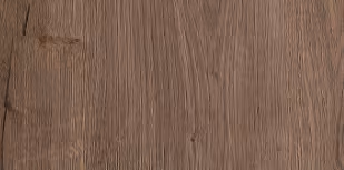 K292 PW Tabacco Honey Oak /K292 PW Tabacco Honey Oak/
Bold and beautiful
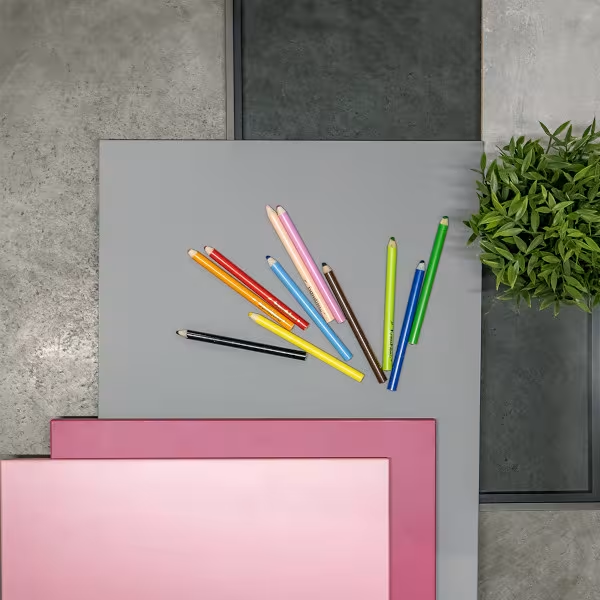
Dedicated to Her, the combination of these romantic decors brings sensual emotions and coziness. They inspire with beauty and warmth and call the power of earth and, and the tenderness of flowers.
Used decors
-
 5437 EE Lino Canovas /MF PB, Kronodesign/
-
 7167 SU Viola /Laminated board, Kronodesign COLOR/
-
 8534 BS Rose Pink /Laminated board, Kronodesign COLOR/
-
 8536 BS Lavender /Laminated board, Kronodesign COLOR/
-
 4298 SU Light Ateller /Laminated MDF, Kronodesign Feelness/
-
 0171 BS State Grey /Laminated board, Kronodesign COLOR/
-
 5437 EE Lino Canovas /MF PB, Kronodesign/
Wisdom of Nature
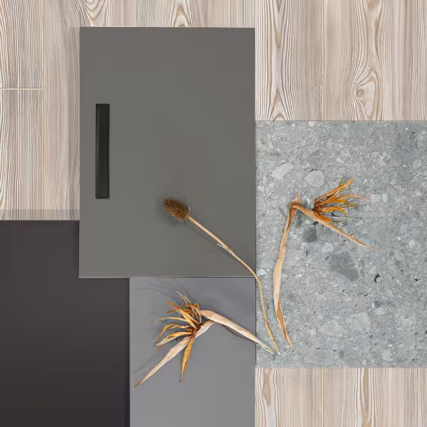
Nature is our example of perfect imperfection. Its magnificence shines through time and reveals the most valuable traces of life. Set this harmony in your home with authentic textures and expressive decors that recreate the mild warmth of wood and the characteristic presence of stone. Use shades of earthy, neutral colors to add layers and emphasize the beauty that comes with age.
Used decors
-
 K473 Pearl Scandi Larrch /Laminate, Krono Original Vintager/
-
 K302 PH Urban Stonecrete /Worktops, Slim Line, Kronodesign/
-
 7184 BS Earth /MF PB, Color, Kronodesign/
-
 6299 UM/BS Cobalt Grey /MDF with matte RET-foil, Feelness, Kronodesign/
-
 0171 UM/BS Slate Grey /MDF with matte RET-foil, Feelness, Kronodesign/
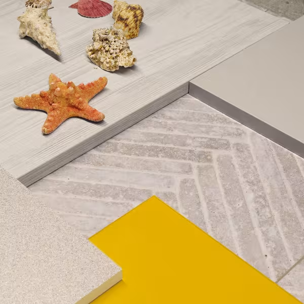
Тhe summer is crazy
Brightened up by sunshine and the joyful smile of sunflowers, the warm summer days infuse us with happiness, wildness and love. Bring this energy to your place with contrasting yellow accents. Add soft textures and neutral light colors to create a relaxing and leisure mood.
Used decors
-
 0134 BS Sunshine /Laminated board, Kronodesign COLOR/
-
 7045 UM/BS Satin /MF MDF, Kronodesign Feelness/
-
 7100 GM White Omega /Worktop, Kronodesign Slim Line Plus/
-
 K083 SN Light Artwood /Laminated board, Kronodesign CONTEMPO/
-
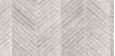 R130 Greige Babylon /SPC flooring, Rocko® Stone/
Down-to-earth Feeling
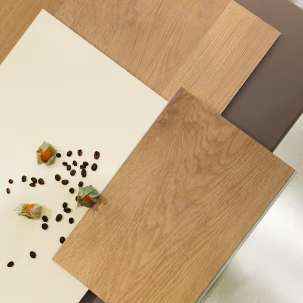
Mother Nature is our home, and we learn from her. She attracts us with divinity and purity, and with timeless spirit. The choice of beige wooden decors, brown hues and light metal or matt surfaces in our interior create that wholesome and down-to-earth feeling – a peaceful design solution for the mind and soul.
Used decors
-
 R081 HS Crescendo /SPC flooring, Rocko® Standard/
-
 0514 AM Ivory /MF PB, Acrylic Matt, Kronodesign/
-
 7166 UM/BS Latté /Ultra Matt PET Laminated MDF, Feelness, Kronodesign/
-
 AL02 Brushed Platinum /MF MDF, Kronodesign AVANT-GARDE METAL/
-
 K295 PW Honey Longbarr Oak /Worktop, Slim Line, Kronodesign/
The summer mood
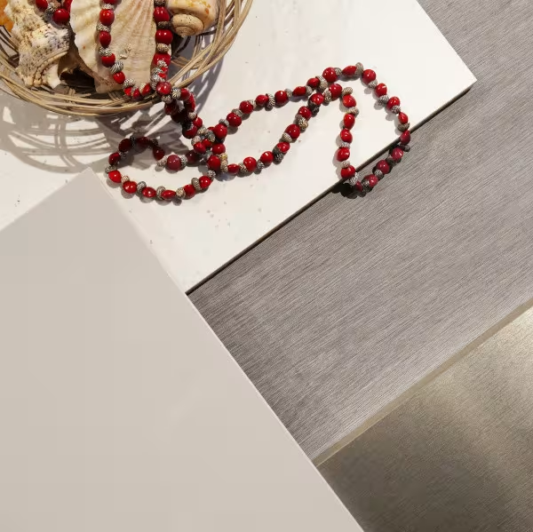
Soft textures, neutral warm colors, a shiny touch and contrasting accessories form an interior solution that reminiscent of the sunny days of summer. This combination brings light and elegance, builds an airy space and conveys that exciting feeling of travelling or being on a vacation.
Used decors
-
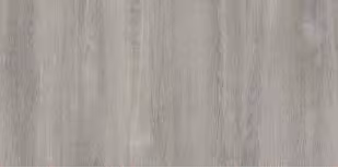 K079 PW Grey Clubhouse Oak /Laminated board, Kronodesign CONTEMPO/
-
 5981 HG/BS Cashmere /MF MDF, Kronodesign Feelness/
-
 K217 GM White Andromeda /Worktop, Kronodesign Slim Line Plus/
-
 AL02 Brushed Platinum /MF MDF, Kronodesign AVANT-GARDE METAL/
The Perfect Formula
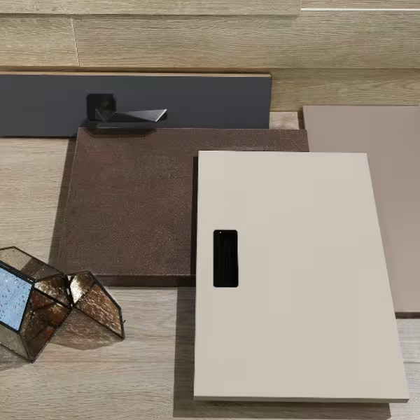
Neutral colors are a rising trend in the interior creation. They remind of nature and add a warm, earthy feeling. Their romantic hue creates overall aesthetics in any space. The combination of contrasting shades such as gentle beige, graphite gray, light oak with 3D effect or rusty brown is the perfect formula for building a dynamic or modern, pronounced design.
Used decors
-
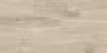 K406 HO Eurus Oak /Laminate flooring Atlantic 10 MO.RE!/
-
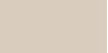 7045 UM/BS Satin /Ultra Matt PET Laminated MDF, Feelness, Kronodesign/
-
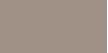 K096 SU Clay Grey /MF PB, Color, Kronodesign/
-
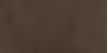 K202 RS Rusty Steel /Round Edge Worktops, Kronodesign/
-
 0162 AF Graphite Grey /HPL Invisible Touch, Color, Kronodesign/
-
 K284 BW Summer Breeze Oak /Wall Panel, Kronowall 3D Krono Original/
The most wonderful time of the year
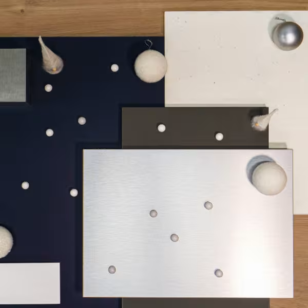
The coldest days of the year bring the most beauty and cozy feel to our homes. The frozen air, the fluffy snow, the breathtaking glimmering landscape tone up our senses. Winter shows us elegance through its purity and simplicity. Use shiny metal decors, contrasting bright and dark colors, soft wood designs and let our inspiration bloom.
Used decors
-
 8984 BS Navy Blue /MF PB, COLOR Kronodesign/
-
 6299 AM Cobalt Grey /MF PB, Acrylic Matt, Kronodesign/
-
 8685 AG Snow White /MF MDF, Acrylic Gloss, Kronodesign/
-
 AL03 Brushed Inox /MDF with Aluminum Cover, Metal, Kronodesign/
-
 AL01 Brushed Aluminium /MDF with Aluminum Cover, Metal, Kronodesign/
-
 K217 GM White Andromeda /Worktop, Slim Line, Kronodesign/
-
 K358 PW Honey Castello Oak /MF PB, CONTEMPO, Kronodesign/
Harmony and Contrast
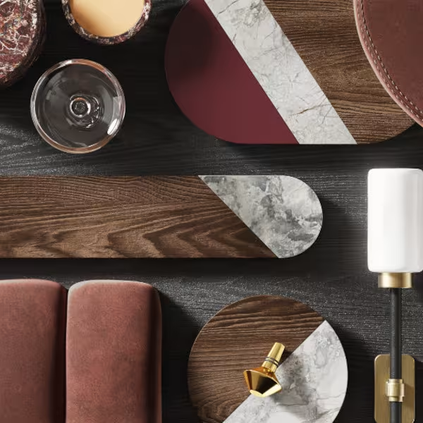
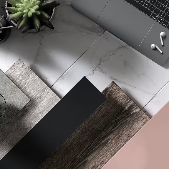
Contrasts make things stand out, no matter whether they are coming from the background or the inside. Black and brown wood decors, where synchro texture is embossed to perfectly match the woodgrain, submerge everything around. To underline this impression, we have a unique marble, twisting grey and white tones in an amazingly graceful and natural way. This dynamic repeat-free design could be combined with a muted reddish uni color to bring warm elegance and strong character to this composition.
Used decors
The work-from-home-challenge
Embracing the work-from-home challenge is a great way to balance the evolving office dynamics. To feel at home in the office or to adopt the working environment at home means being adaptable. Using versatile decors reflects that manner of life and is essential for creating a multifunctional interior. Just keep it classy, simple and elegant regardless of whether it is an official or casual setting.
Used decors
Life on the Move
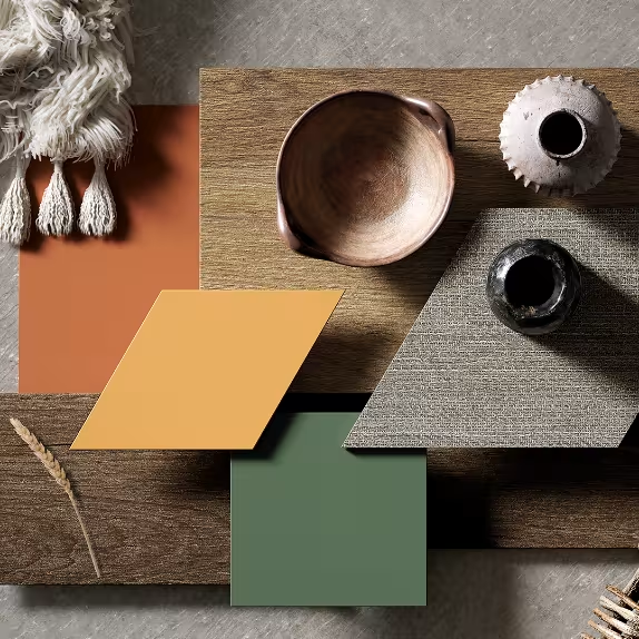
With the upcoming spring, Mother Nature wakes up. Our desire to be closer to her, travel, and create new memories is getting stronger. So we project in our home interior the impressions from our own experiences – the colors of sunset, deep wooden textures, stone and textile surfaces, with the idea to establish around the comfy feeling from our life on the move.
Used decors
-
 K514 SU Deep Sahara /MF MDF, Color, Kronodesign/
-
 K521 SU Smoke Green /MF MDF, Color, Kronodesign/
-
 K516 SU Toffee /MF MDF, Color, Kronodesign/
-
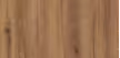 K530 HU Amaretto Hudson Oak /MF MDF, Harmony, Kronodesign/
-
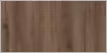 K554 HU Chocolate Hudson Oak /MF MDF, Harmony, Kronodesign/
-
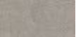 K550 SL Dove Venera /Worktop, Square Edge, Kronodesign/
-
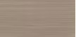 K542 PN Mocha Tessea /MF PB, CONTEMPO, Kronodesign/
Colors and Shapes
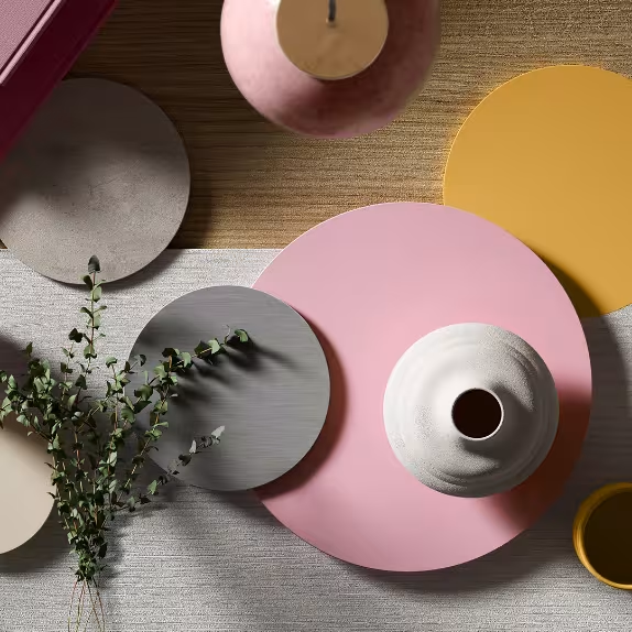
The colors of spring bloom in our April combination. Round shapes, soft contrast, stone and metal decors enter a joyous mood and positive attitude toward the surrounding world. Looking forward to nature changing, we transform the functionality of our place with floating motion and novelties in detail.
Used decors
-
 7045 AM Satin /MF MDF, Color, Kronodesign/
-
 K513 SU Marshmallow /MF MDF, Color, Kronodesign/
-
 K516 SU Toffee /MF MDF, Color, Kronodesign/
-
 K524 SN Pure Surfside Ash /MF PB, CONTEMPO, Kronodesign/
-
 K525 SN Blonde Surfside Ash /MF PB, CONTEMPO, Kronodesign/
-
 K538 PN Dovetail Arosa /Kitchen splashback, Kronodesign/
-
 K523 PE Platinium Disk /Worktop, Square Edge, Kronodesign/
Spacious Mind
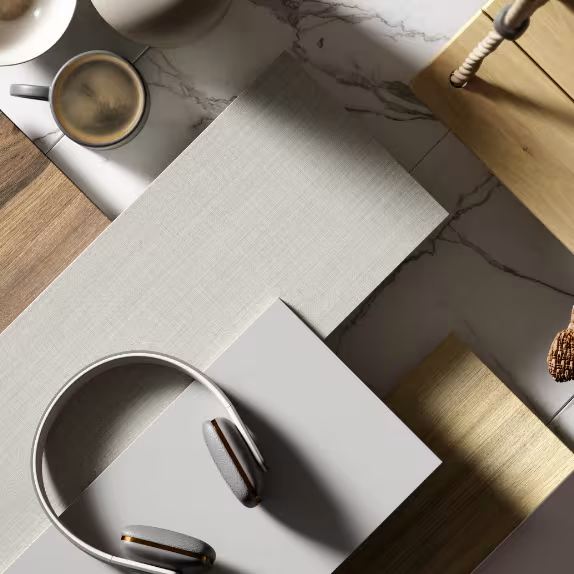
With the ever-changing world, technology, and trends on the go, we all share our daily lives. Willing to be more creative in work, we strive for a balanced environment and bring our home rituals to the office. Using poised, earthy tones and materials like warm wood, marble, and textiles that remind us of a coffee-bar style seating, is the key to a successful co-working surrounding because the more a space can offer, the more spacious our mind will be.
Used decors
-
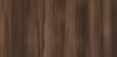 K537 RW Ristretto Baroque Oak /MF PB, CONTEMPO, Kronodesign /
-
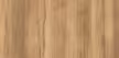 K535 RW Gold Baroque Oak /MF PB, CONTEMPO, Kronodesign /
-
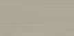 K541 PN Greige Tessea /MF PB, CONTEMPO, Kronodesign /
-
 7181 BS Dark Chocolate /MF PB, CONTEMPO, Kronodesign /
-
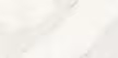 K551 SU Calacatta Olympus /Worktop, Square Edge, Kronodesign/
-
 K519 SU Mouse Grey /MF MDF, Color, Kronodesign/
Everyone deserves a unique and personalized look
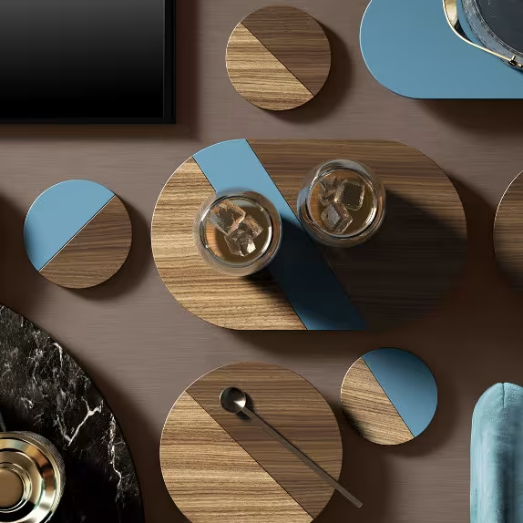
Every detail of the composition is essential in creating an exceptional interior space and establishing an opulent and contemporary aesthetics. Always a focal point, the black marble with a crystalline veining structure adds a glamorous and masculine flash to any modern furniture piece. Combined with a metal decor with matt texture, it reaches a new level of exclusivity. Linear wood decors and a soft blue touch complement the sophisticated environment and settle a unique and personalized look.
Used decors

Let your true colors shine
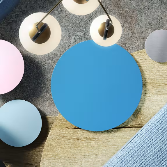
Your place should be an oasis that energizes and inspires you. Bravely mix and match unexpected textures, accentuated wood decors or unique stone patterns. Incorporate playful elements like round shapes, colorful shades, and funky furniture that radiate optimism and spark conversation. Fill your shelves with objects that fuel your passions and tell your story. Let your imagination run wild, and remember, your interior design should be an extension of your vibrant soul!
Used decors
-
 K513 SU Marshmallow /MF MDF, Color, Kronodesign/
-
 K517 SU Azure Blue /MF MDF, Color, Kronodesign/
-
 K518 SU Surf Blue /MF MDF, Color, Kronodesign/
-
 K523 Platinium Disk /MF MDF, Color, Kronodesign/
-
 K540 Grey Albus /MF PB, CONTEMPO, Kronodesign/
- K527 Biscotti Hudson Oak /MF MDF, Harmony, Kronodesign/
-
 K529 Gold Hudson Oak /MF MDF, Harmony, Kronodesign/